Fonts: the key to expressing your brand
Fonts are like eyebrows:
- They add expression.
- They can be thin, thick, straight, or curly.
- They’re not something that people immediately spot, but if you don’t take care of them, people can be massively put off.
- They can be expensive to maintain.
- They can be hand drawn (proceed with caution).
Anyway, now that grand analogy is over, let’s BROWSe through the information (I’m sorry).
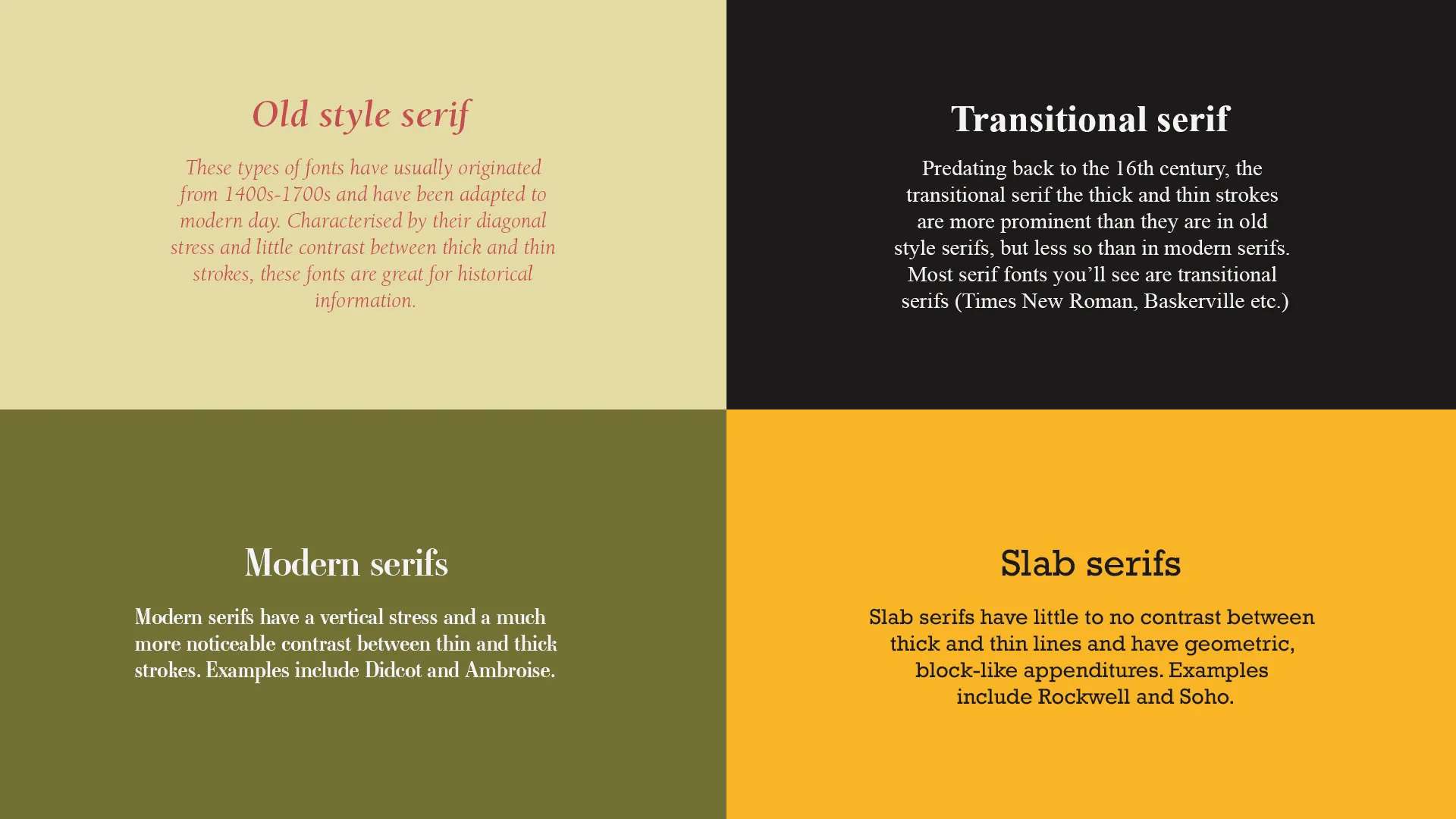
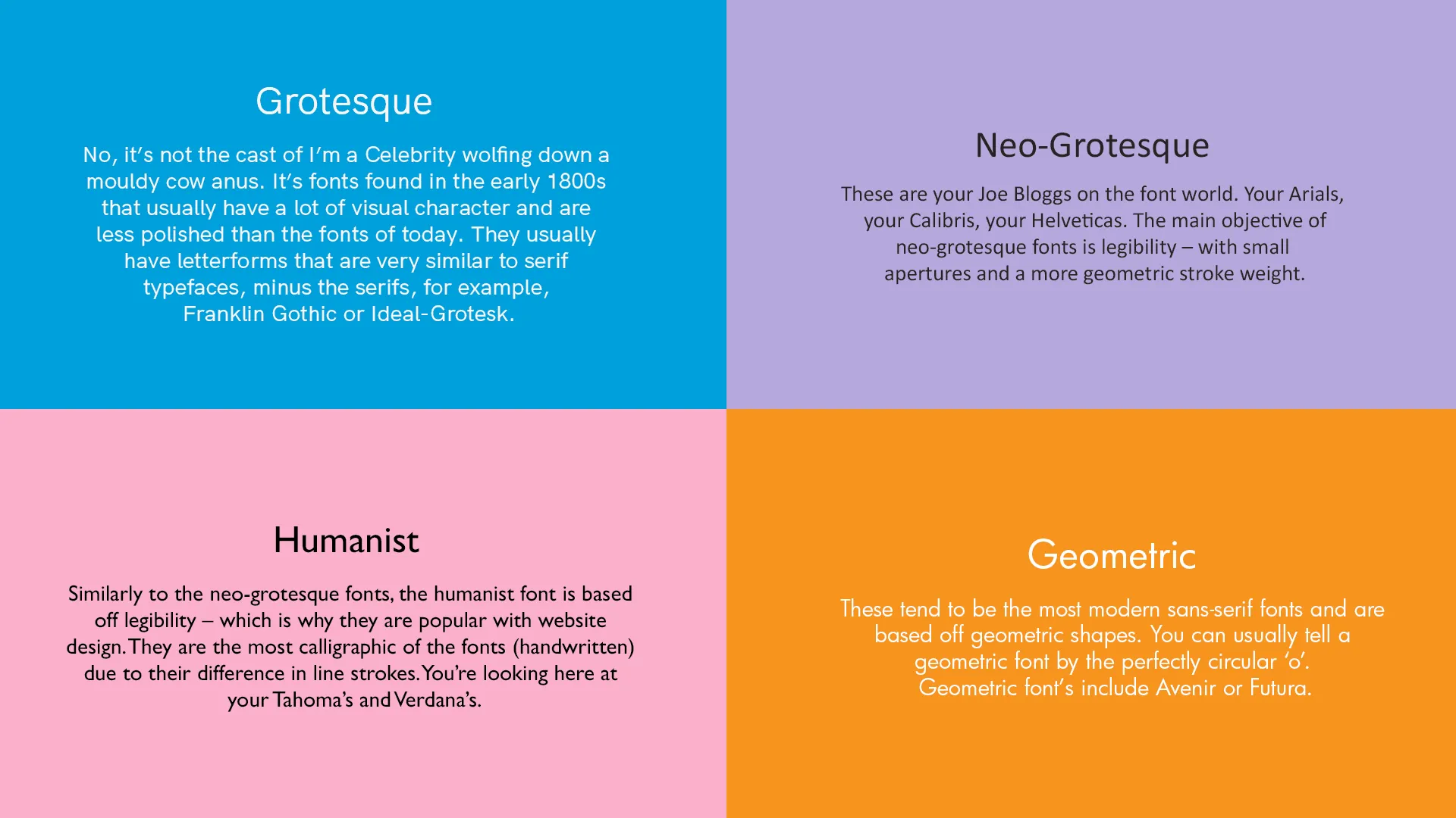
Let’s start with the different types of fonts that we have at our disposal:
8 minute read
6th December 2023
Serifs – Pre 1800’s
San Serifs – Post 1800’s
How fonts evoke feeling
It’s time to face facts. Fonts are one of the most essential design tools in a visual marketer’s repertoire. The font(s) you choose play a crucial role in the message you want your brand to convey and are up there as one of the most important visual elements that you must consider.
It’s so much more than words on a page or screen.
Colour psychology is something that most people are familiar with. The fact that our behaviour and mood is affected by what colour is in front of us. Red is powerful, blue is dependable, yellow is optimistic, green shows growth.
Well, it’s the same with fonts. The psychological associations we make when seeing different typography inspire different ideas and emotions.
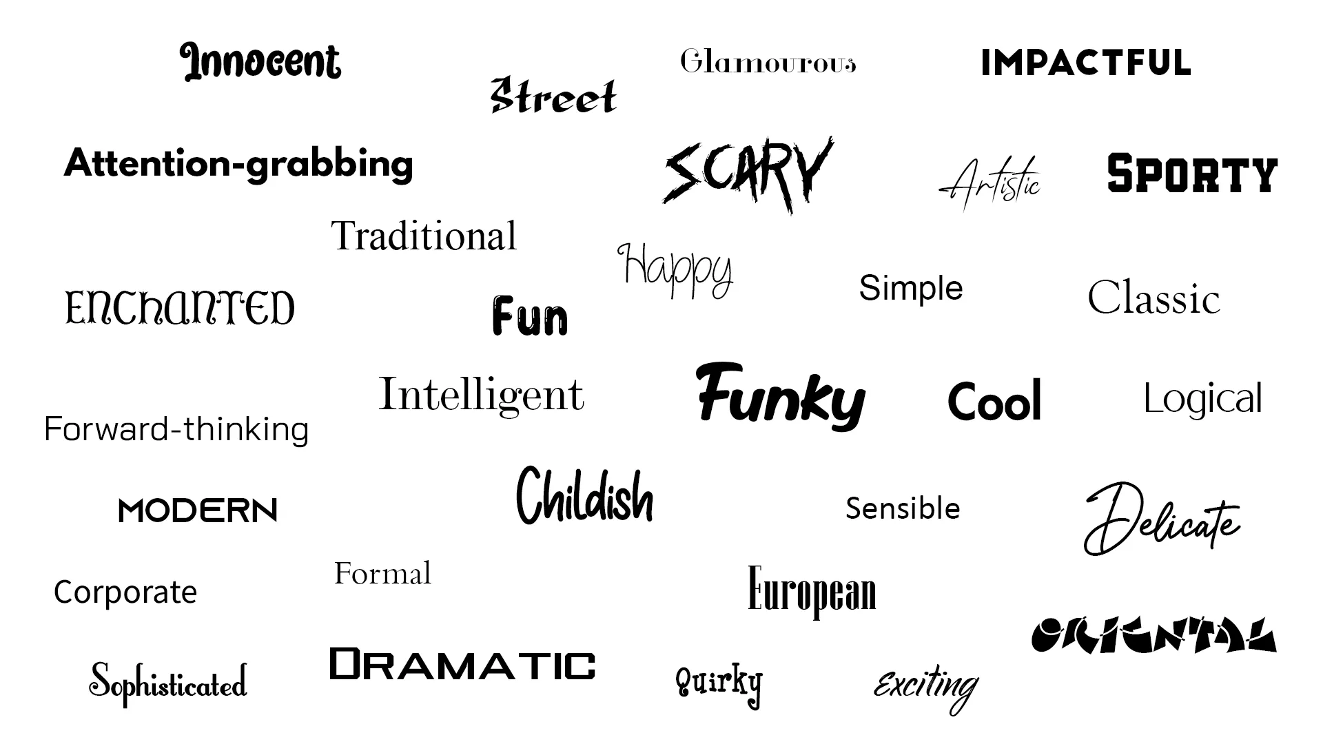
The feelings that certain fonts evoke is often inherent. The exercise below highlights this:
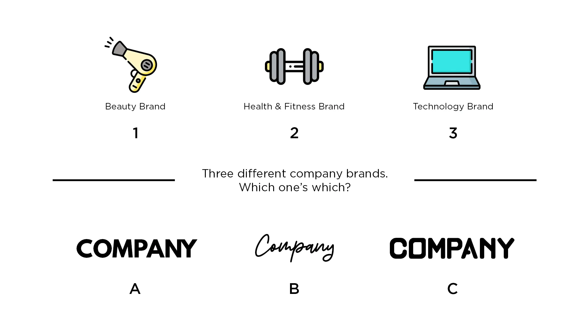
More than likely, your answer is 1B, 2A, 3C. But why is this? Why do our brains immediately make the association?
Well it’s like any cognitive function – we are genetically programmed to view and feel a certain way when exposed to visual stimulus. It’s why a long sandy beach makes you feel calm and relaxed, whilst a dark windy forest makes you feel on edge.
Typography is being subconsciously analysed by the brain and associations are pulled without you even noticing.
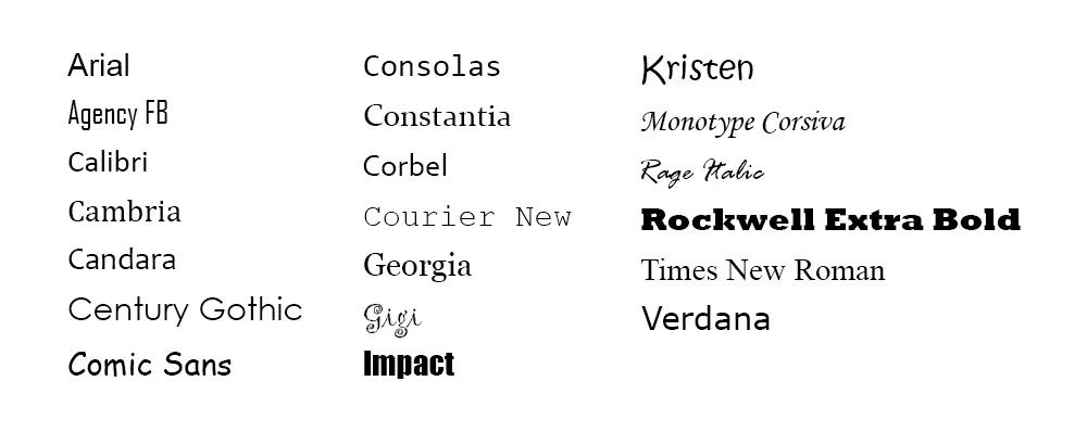
In 2006, the Software Usability Research Laboratory at Wichita State University conducted a survey to see if certain fonts are tied to certain emotions. The fonts they tested are shown below:
In their 500 person survey, participants assigned personalities and emotions to each font, with the grouped results shown below:
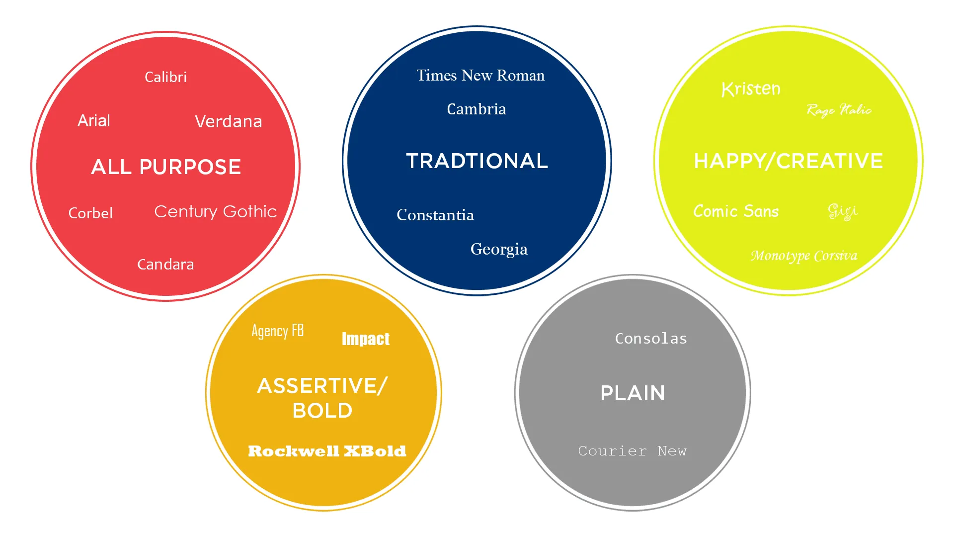
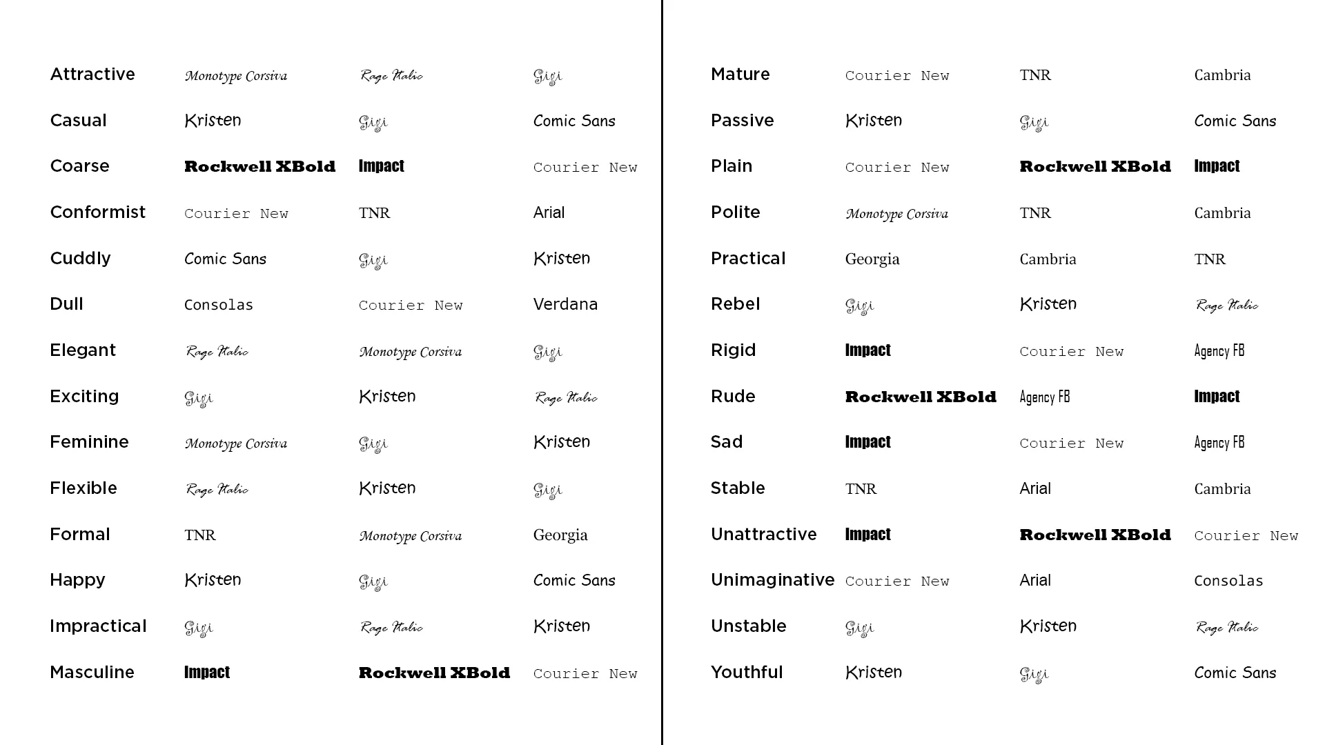
The results revealed that serif fonts were viewed as stable/mature, script fonts were seen as feminine/casual and modern fonts were seen as masculine/assertive.
The emotional ties that people place on different typography provide interesting insights into the psychology of a customer.
This innate ability to categorise fonts into different emotions provides immense possibilities for marketers.
Being able to interact with the subconscious part of a consumer’s mind is something that cannot be overlooked. For your company, it is an opportunity to guide and reinforce your brand’s personality.
How to choose the right font
Well, this is the potential million-dollar question. And often, there isn’t a definitive answer.
Although there is always a wrong answer.
Let’s go back to the eyebrow analogy. When you meet someone for the first time, what’s the first thing you notice? Their eyes? Their nose? Maybe their rippling biceps?
When first making someone’s acquaintance, you rarely notice their eyebrows. This is unless the person in front of you looks like this fella:

Then you can’t stop staring.
Well, it's a lot like a font. If you choose the right font, it’s often overlooked (in a good way). However, if you select the wrong font, it can have a really negative effect on your brand.
Take the example below. Imagine you’re a multi-millionaire (we can dream) looking to buy shares through an investment company.
You have a look around and you come across Diamond Group Limited. Strong name. Strong client base. Managing 6.8 billion pounds worth of assets worldwide.
Then you come across their logo:
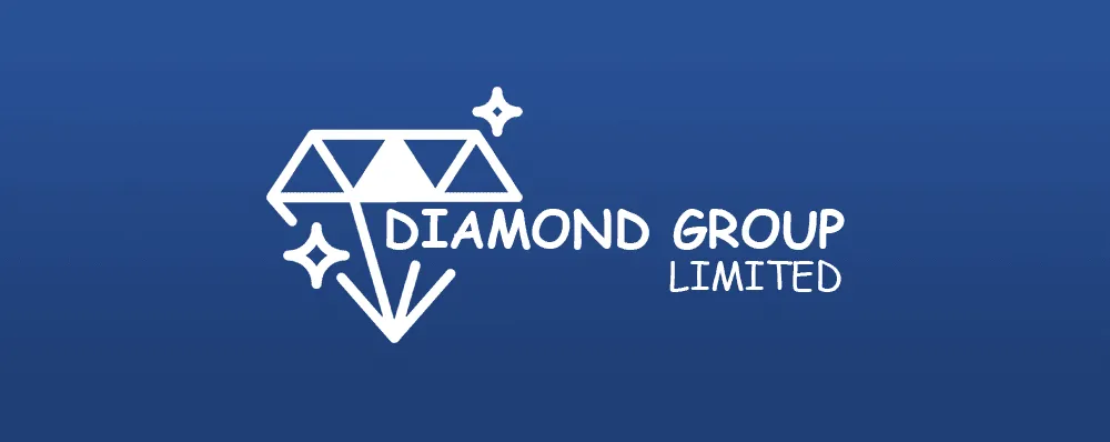
Comic Sans. Immediately, you bring their professionalism into question. With so many investment companies out there, there’s a good chance that their chance of acquiring your business has just evaporated.
All over a font.
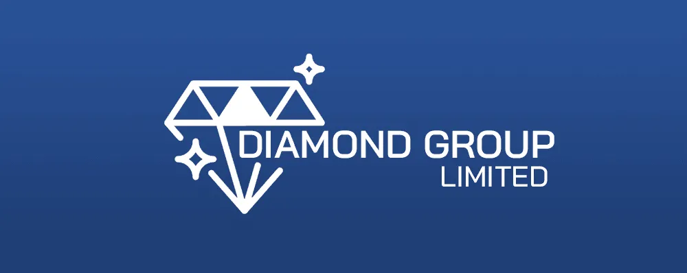
Now compare that to this font. A strong Bai Jamjuree sans-serif font which ties in with the core brand messages of stability and expertise. It’s not necessarily a font and logo combo that'll set the world alight (I can’t see myself picking up a Drum graphic design award anytime soon) but just by making that simple font change, it goes from incompetent to respected.
Alongside the impressive portfolio and sweet-talking customer service, suddenly Diamond Group Limited are looking like the perfect company to buy some shares with.
The power of typography.
Whilst there’s no ‘right way’ – a one-size-fits-all, cookie cutout model for selecting fonts – having an idea of how your font makes consumers feel is essential when building your brand.
Ensuring that the emotions that the font evokes are consistent with your brand message can make all the difference for potential customers.
So, the moral of this story is: don’t overlook it. Take time on your typography. Leave love for your lettering. Frenetically fantasise over your fonts.
And don’t use Comic Sans. Otherwise, you’ll end up with a monobrow. Or something like that.
Source: https://blog.hubspot.com/marketing/typography-emotions