In contrast
In the present day it is vital that brands, big or small, are considerate to all audiences when communicating their message and identity. Respect needs to be shown to those whose ability to take in information is affected due to a variety of reasons. Not only should disabilities and learning difficulties be taken into account, but someone could be affected by their circumstantial health (they may be tired or perhaps recovering from a stroke), their location (they could be in a noisy restaurant or far away) or their equipment (they may have forgotten their glasses). Accessibility should be at the heart of the design process from the very beginning, not an afterthought.
8 minute read
23rd November 2023

As a creative agency we strive to understand and remain aware of our environment in the world of branding and inclusivity. There are many ways in which accessibility can be woven into design in order to provide a solution that is available to all. There are three core aspects that can be applied across all design principles and verticals.
Visual accessibility
Brands often have their hands tied behind their backs when it comes to changing the look and feel of their identity, which is why it is of the utmost importance to set out initial structures in place that empathise with all audiences. What may look better from a design point of view may not always be the right path to take.
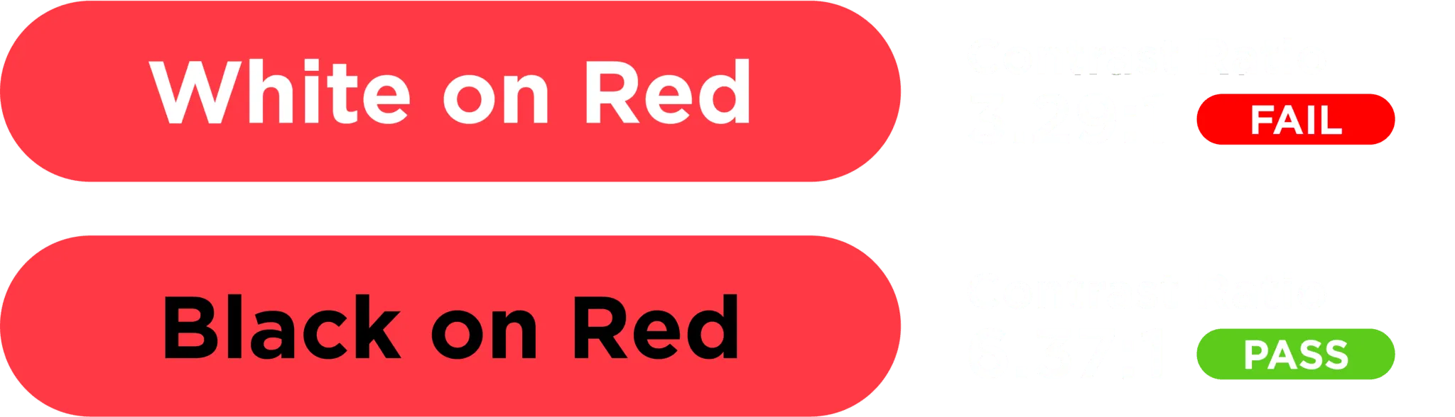
Contrasting colours is key when creating ephemera that is to be viewed across both digital and print platforms. As you can see from the example below, most would say that the ‘white on red’ button looks the best, however as the statistics show – the ‘black on red’ variation is far more legible due to its contrast ratio (the optimal being an AA colour contrast levels, a minimum of 4.5:1 ratio).
Text
Large, clear fonts are quite understandably going to be the most legible. As visually appealing as some accent and display fonts may be, one must always refer back to the basis of easiness to read and absorb by all audiences. There are several areas of typography to consider.
- Typography within all forms of publication must be a minimum of 12pt size.
- Use no more than two or three typefaces.
- Align text to the left.
- Keep rag and paragraph shaping consistent.
- Use sentence case, as capitalising the first letter of a sentence is far easier to digest.
- Avoid underlining and italics, keep text simple.
- Use clear and concise language.
Layout
Whether someone is reading from screen or print, an organised and clear layout will drastically improve the ability to take in information. In design, setting out paragraph styles for headlines, body copy and captions will help to split up the layout into easily digestible sections. If it wasn’t for hierarchy, a document or advert may be quite overwhelming, resulting in the reader spending more time reading every word to get to the information they are seeking.
Case study: Our approach to accessible design for RSA
As an agency, we don’t only need to think about how we layout and deliver content to make it more accessible, but we also think about the words we use. You can see an example of this with our vulnerable customers guide that we wrote and designed for RSA.
We acknowledge that every person is unique and that there are a range of different barriers that people may face when it comes to reading, interacting and understanding information. These barriers include:
- Poor literacy skills
- Taking longer to understand information
- Anxiety through lack of understanding
From taking the time to understand these barriers, we wrote a guide for RSA employees to support their written communications with customers. This included applying a human first lens, taking into consideration customers’ individual circumstances, showing empathy and reassuring where necessary. From a design and structural perspective, we advised using short, simple sentences, bullet points and appropriate language, making it more accessible to a diverse range of audiences.
Summary
While all of these practises may seem commonplace, it is so often overlooked or ignored by brands who are intent on keeping up with the modern day trend. Due to this they are put in a compromising position whereby they run the risk of drastically changing their image and identity. Branding is often seen as a higher priority than accessibility, which can be understood in some scenarios as visual branding plays a big part in how companies get recognised and loved by people.
The way to solve this is to implement accessible design right from the beginning of the company or brand’s identity process. Always make sure accessibility is understood and has a voice in the initial design process, as style refinement can follow later down the line. Don’t wait for a rebrand to fix it, as by then it will be too late.