 Blogs
BlogsMaking the web playful again
The internet is all grown up
It’s responsive, fast to load, easy to read, great to look at (mostly). But it’s also heavily templated, predictable and just a bit unexciting, really.
7 minute read
23rd November 2023
When I was a lad…
It’s easy to look back with rose-tinted glasses, but back in the early days of web design, it felt like there were no real rules. Well, apart from everyone in marketing insisting that everything should be ‘above the fold’. Apparently no-one knew how to scroll back then.
Every single website looked different. Half the fun was trying to work out where the menu was whilst trying not to get sidetracked by all the scrolling, colour-changing text and animated GIFs everywhere.
There were a lot of terrible, terrible sites out there of course. But it was a really exciting time. I feel quite fortunate to have been in this industry long enough to remember when digital typesetting was relatively new (remember QuarkXpress anyone?) and Photoshop didn’t even have layers. And whilst that makes me a bit of an old timer, it does I think give you a different perspective on the things that ‘younger’ designers take for granted.
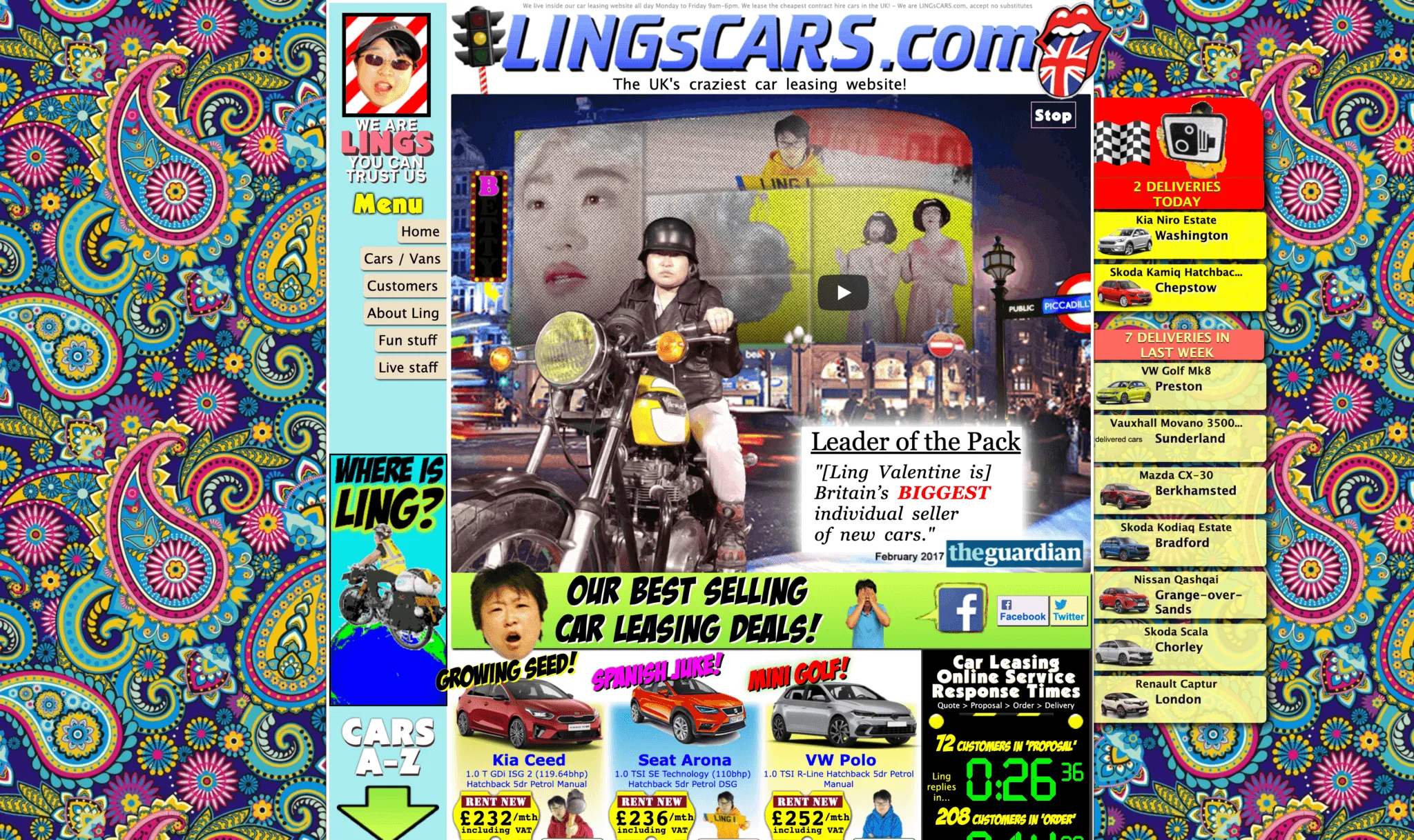
For all those who hanker after the 1990s, this website does a reasonable impression: https://www.lingscars.com/
But where does that leave us now?
Mobile-first, baby
In 2022, a responsive site is frankly the least you expect (unless there’s a very good reason for locking it down to a single device or platform).
Coined by Ethan Marcotte in May 2010, responsive web design (RWD) is the idea that “[website] design and development should respond to the user’s behavior and environment based on screen size, platform and orientation” Source: Smashing Magazine.
In 2016, mobile browsing overtook desktop viewing – so it makes sense that most websites take a mobile-first approach. But you can’t alienate people using laptops or tower PCs – and a fundamental part of good design is to make information accessible to all users. And of course the desktop view is still considered the party piece for most creatives. It’s all big, shiny and immersive – like comparing a pic on instagram to a 20×24 framed photo.
But let’s face it, responsive design is great for us as everyday browsers. I might check out a site on my big screen at work, then I’ll dip back in later on my phone at home in the evening. But really great responsive design does not make it easy to create truly engaging, seamless experiences across everything. Those in-between viewports are notoriously hard to nail for a start. What looks great on a 27” Retina display does not always translate well onto a Chromebook or a Kindle.
Thankfully there are good (and bad) learnings to draw on.
There’s a pattern here. And there
Most of the larger websites we build at Bright Blue Day tend to sit on a CMS like WordPress, Umbraco or Kentico. The reason for this is simple. Our clients need to be able to spin up new pages, change menu items, add content to existing pages, and just generally edit and administer what and when they need it. All without the need for a team of developers.
So rather than building out a batch of individually designed and hard-coded pages, what we tend to do is create a flexible design system. From a library of components, a content editor can slice, dice and create as many variations as they like in order to change up whatever they need in fairly short order.
It’s great for brand consistency, user experience and also speeds up content and campaign launches. It also lets us focus on really nailing the little details – ensuring each component is working and looking its best across as many scenarios as possible.
This system is called Atomic Design. There’s a great article (and accompanying book) by Brad Frost on the subject.
If you really want to explore the belt and braces approach to this kind of system, you can rely on Google to cover pretty much everything: https://material.io/components?platform=web – definitely worth a look over for any aspiring designer or developer.
Because of this type of system, we all know what works.
How do you avoid the identikit approach?
If you were to be harsh about it, you could say that everything kind of looks the same.
Well sure, take the colours and fonts away, lose the images – and suddenly you have a wireframe. And yes, my wireframe probably looks like yours.
But graphic design, particularly layout-based design, has always had constraints. Grids existed in brochures and books since the dawn of print. It’s what you do within them that counts.
We all have to make websites that work. They need to be indexable, discoverable and easily navigable. But they should also be delightful, intuitive, immersive and even addictive.
Have more fun
Beyond a promotion/competition landing page, it’s rare that we get to build a truly single-minded web page. These people did just that and had a barrel of fun with it (Warning: may contain offensive language): https://makefrontendshitagain.party/
When you have a single-minded ‘thing’ to talk about (eg. a new product or a cause), you can go wild with the storytelling. This approach is best used on microsites or single page web experiences – people like Apple and Bose have always done this well when they launch new products.
But what about when you have a more complex, commercial proposition?
Little things make a big difference
As with most things in life, the difference between good and great is largely in the execution and application of detail. There are ways and means of elevating the experience – the sprinkles on top that help make a site memorable and joyful to use.
Big ideas make your site more fun
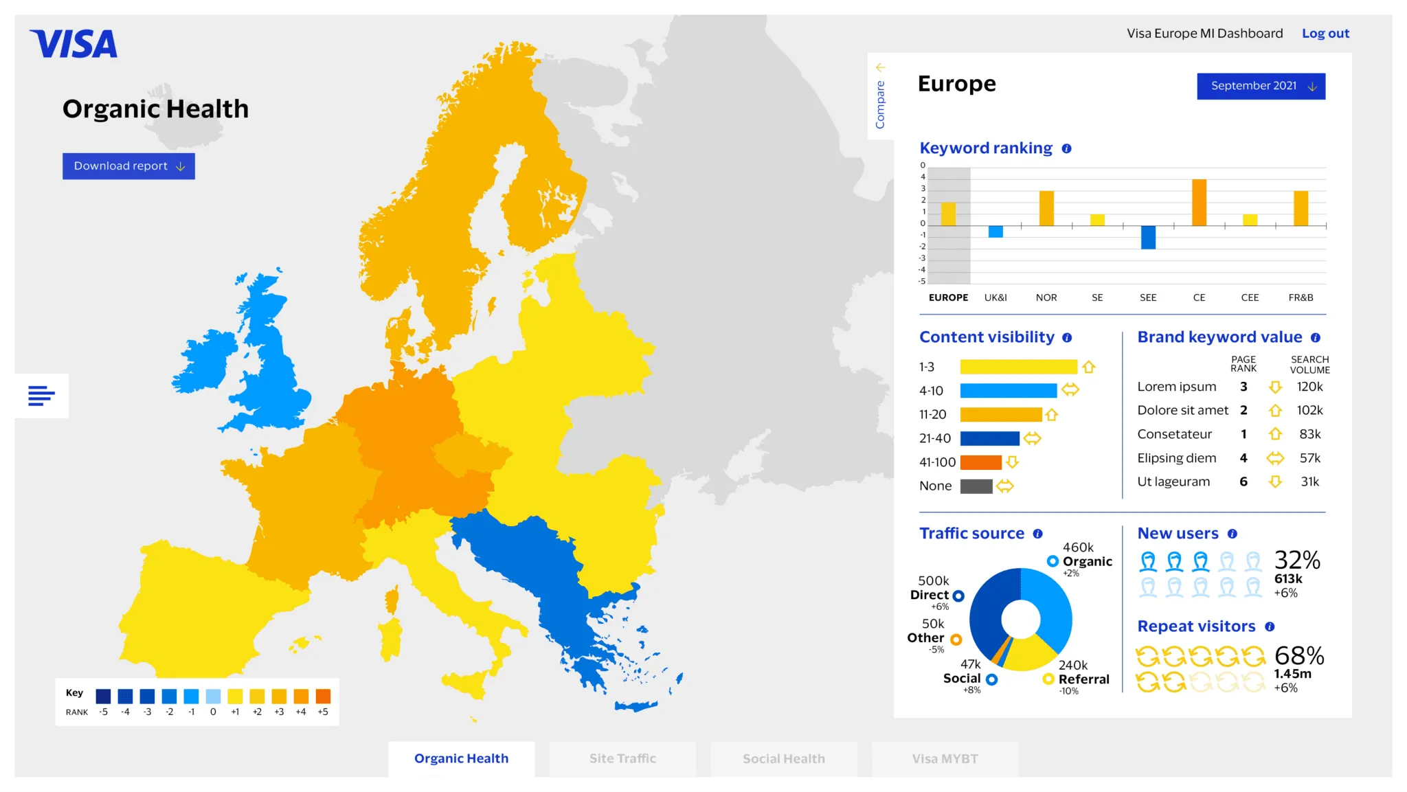
Gamification – in the days where people printed physical things, this would have been a scratch-card or a quiz. In web terms it could be a cipher or ‘easter egg’. We’ve created many of these for Visa over the years. Or it could be as simple as letting people play in real time with their data, like we did for Visa and their pan-european data dashboard, or the Quintet Earth Calculator Tool which visualises the environmental impact of an investment.
Introduce a hero ‘wow’ moment – this could be cursor-tracked 3D effects [example] or a scroll-triggered animated diagram. It’s about breaking the mould and creating the unexpected. Dribbble and the like are full of inspirational examples. But check with a dev whether it’s really possible or you might be disappointed as a lot of those ‘examples’ are pipe dreams.
We made a series of delightful little abstract looping animations and interactions for a Veritas microsite (sadly no longer live but see the visual below) – which took their previously very restrained brand in an entirely new direction.
Use micro-interactions – If you were to think physically, this would be using embossing or tactile surfaces to enhance the look and feel of product packaging. It’s the things that scream quality when you open the magnetic lid and slide the product out of its so-tight-it’s-in-a-vacuum recess.
On a website it’s those subtle, but lovely little moments – the way a button animates on hover or tap, or those magical transitions where objects or photos morph from one page to the next through clever animation. Like the experience we have recently built for Visa’s European Innovation Team.
Ways to add the ‘sprinkle’
Here are my top tips for aspiring digital designers:
Tip 1: Design playfully – Break the grid, lean on white space and effects like parallax to reveal content in a more interesting way
Tip 2: Write copy that appeals to people, not just search engines. SEO is perhaps more important now than ever – as we transition from meta descriptions and head into the metaverse. And be human. Your brand doesn’t have to be funny, but it does need a well-defined and well-articulated personality.
Tip 3: Soak everything up. Be inspired – and not just by other designers or looking at websites and apps. Watch films. Read books. Go visit new places and talk to new people.
And just in case you do need a little inspiration, here are a few places that might help you in the hunt for your next spark:
Ready to play with us?
bbd have full-stack, in-house digital capabilities. Which means we can help you plan, design, build, refresh, rebuild, re-platform, populate, manage, maintain and optimise your website. From information architecture, UX analysis, SEO copywriting through to security testing and deployment. Being pretty-much tech agnostic, we’ve built sites on WordPress, Adobe AEM, Umbraco, Kentico and more using front end frameworks like Bootstrap, Angular, jQuery and React, Next.JS.