TAKING DPS TO NEW HEIGHTS
dps have been picking, packing and delivering fruit since 1977, across over 40 countries. bbd were tasked to create a new brand and visual identity for the holding company Terradace.
The name originated from the term TERRA (Latin for Earth) and DACE which is the initials of Paul & Neil’s (their two primary shareholders) four children. The identity could leverage themes of the earth, trade, fresh produce, farming and geology.
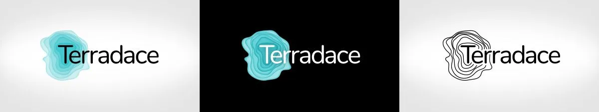
Contours mark the way for Terradace
Services provided:
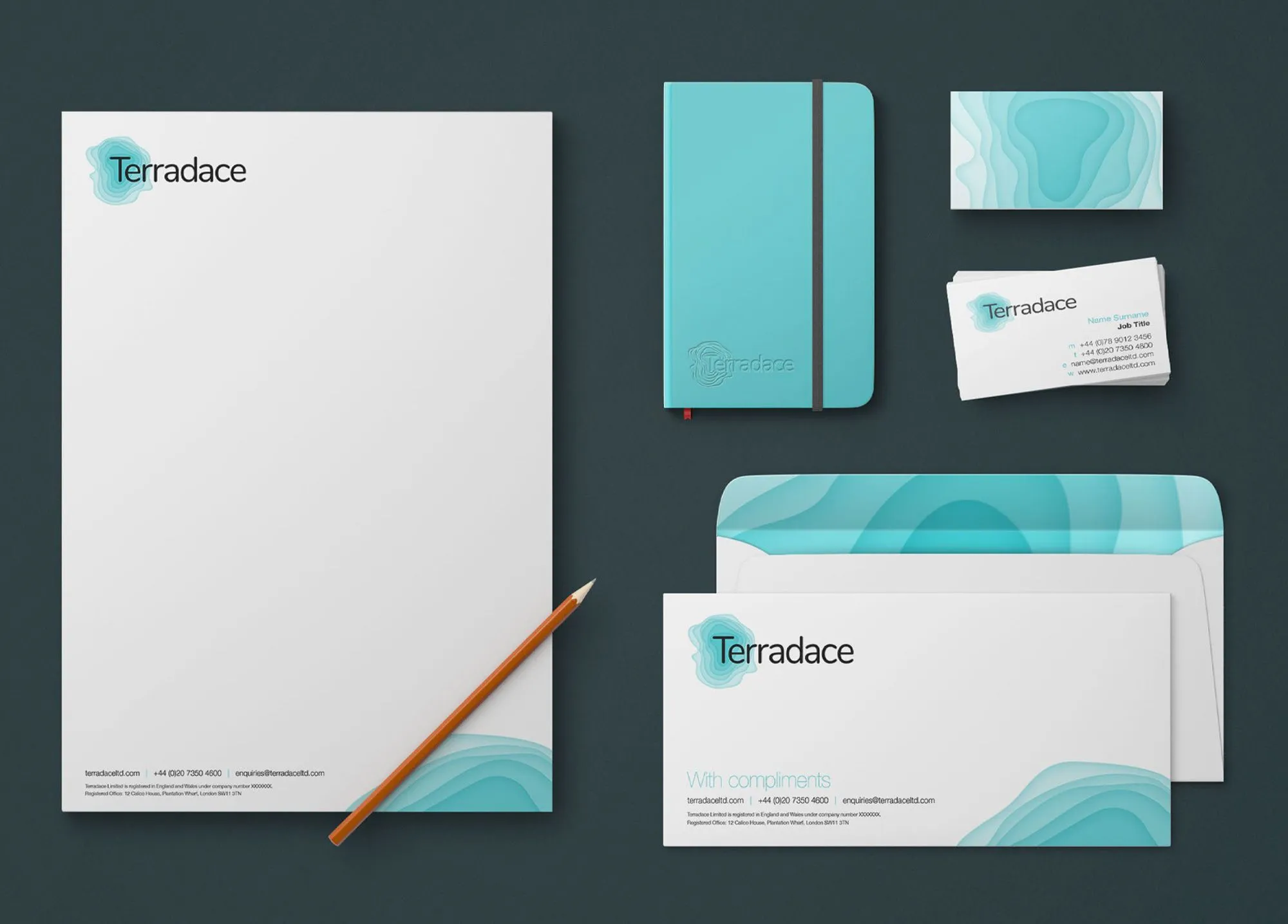
Creating a flexible, eye-catching identity
Using the planet and cartography as our inspiration, we explored different ways to bring to life a global, sustainable organisation, using the starting points of:
Strata – Focusing on the Earth’s structure, visually representing that dps has many layers within its own ecosystem of companies and industries.
A sense of place – Combining the concepts of geographical locations, environmental diversity and natural resources.
Concentric circles – Exploring the idea of growth and stories formed and recorded over time.
A modern identity for a forward-thinking company
The final identity enabled us to represent the layers of complexity and depth of knowledge within the organisation and its operations. All whilst using of contours to tie Terradace back to the idea of the Earth and its resources.
Using colours that are bright, eye-catching and a step away from the usual dark corporate colours we created an identity that is fresh, optimistic and made for the modern world.
"Very happy with what you guys have provided us on this project as always – thank you!"
Stuart, dps
Could you be our next client?
If you’ve seen something in our case studies that got you excited, made you want to learn more, or you’d just like to meet the team behind the work – let’s talk.